A modern spin on a local physio, celebrating movement in very form.
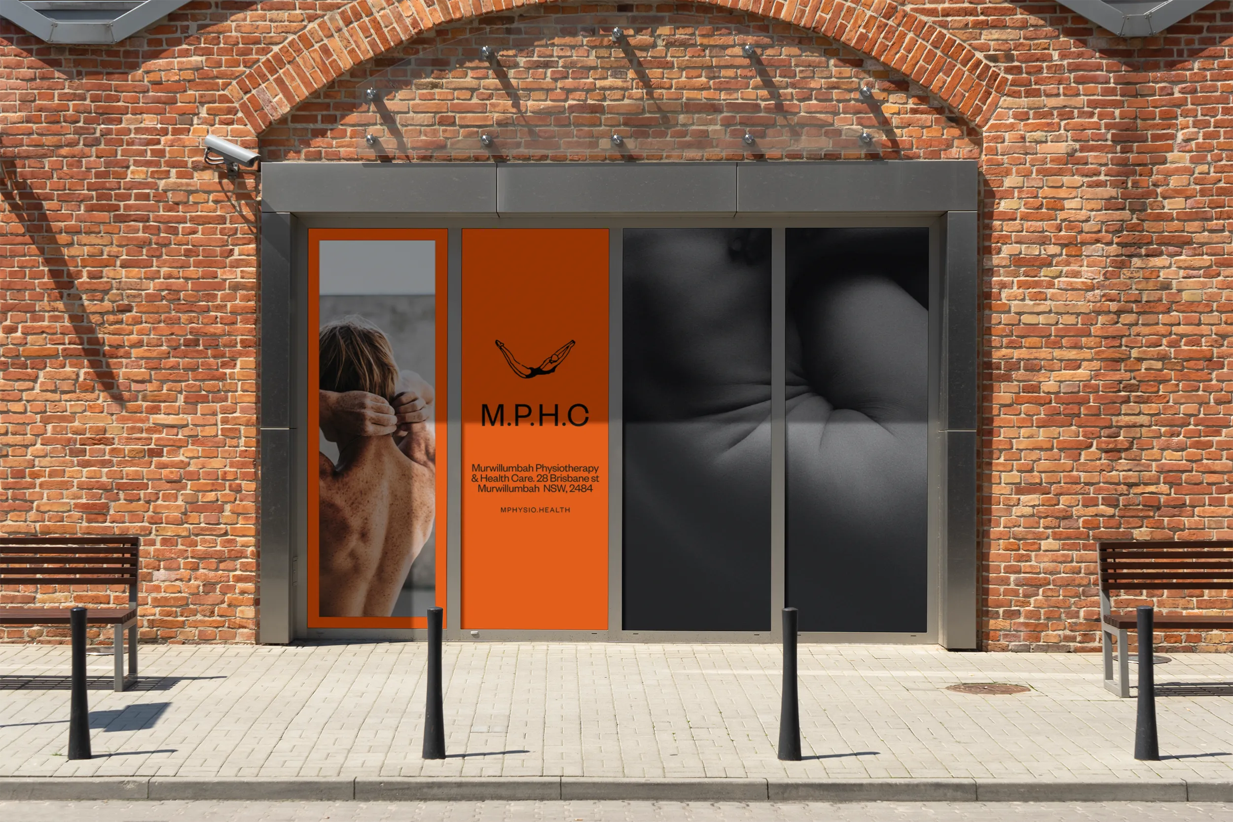
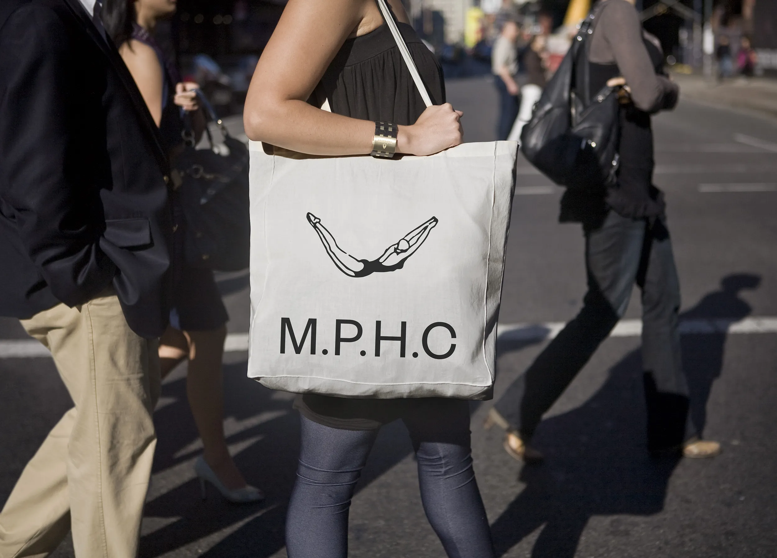
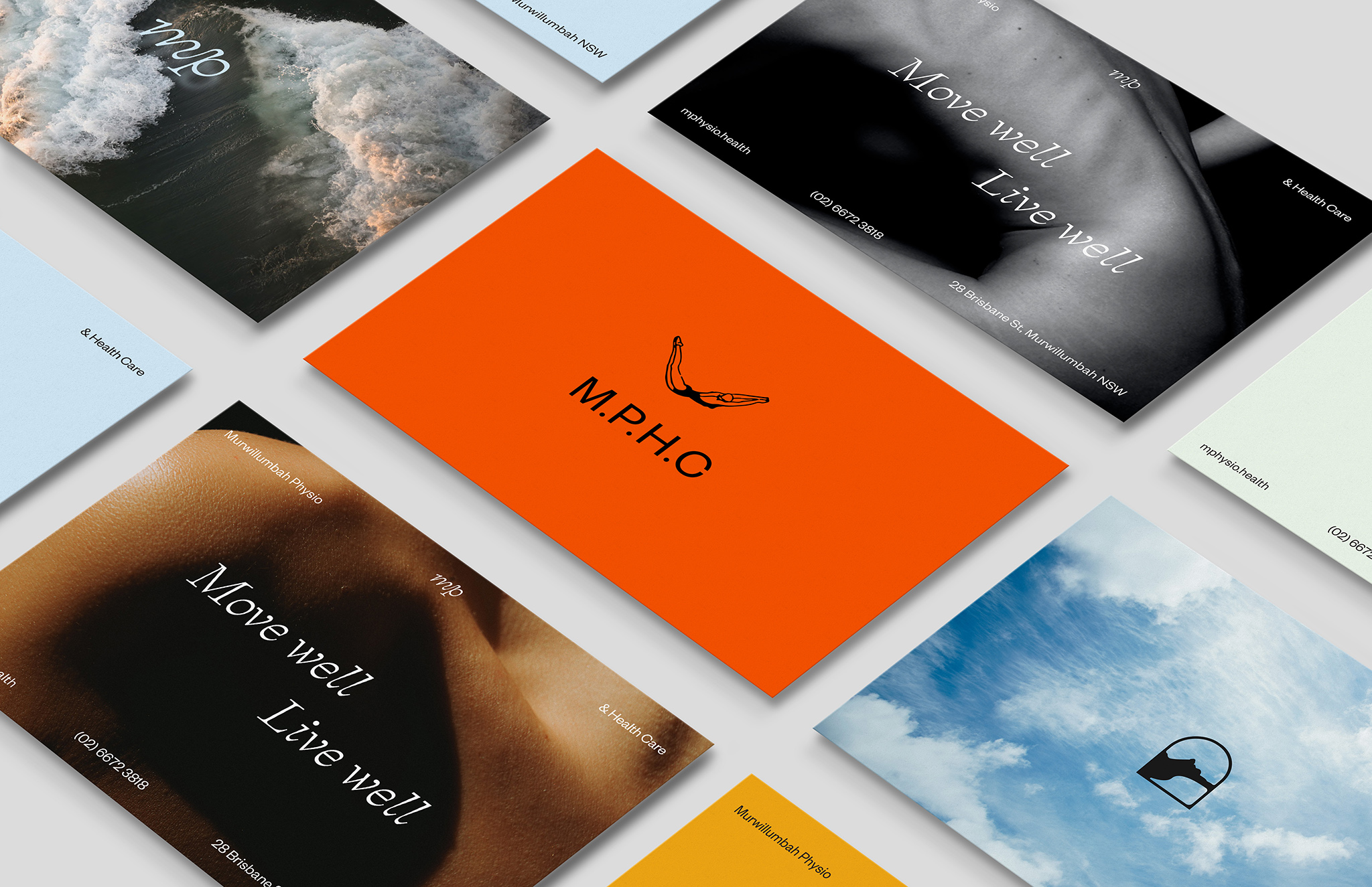
Murwillumbah Physiotherapy and Health Care (MPHC)'s rebrand was designed to position the business as a modern, energetic alternative to traditional physiotherapy, with a focus on celebrating movement and the natural beauty of the local area. Our team crafted new logo, monocle, colourways, brand bible, voice and tone, all reflecting MPHC's values and unique approach to wellness. The website refresh was the final touch, giving MPHC an online presence that perfectly captures the spirit of the brand.
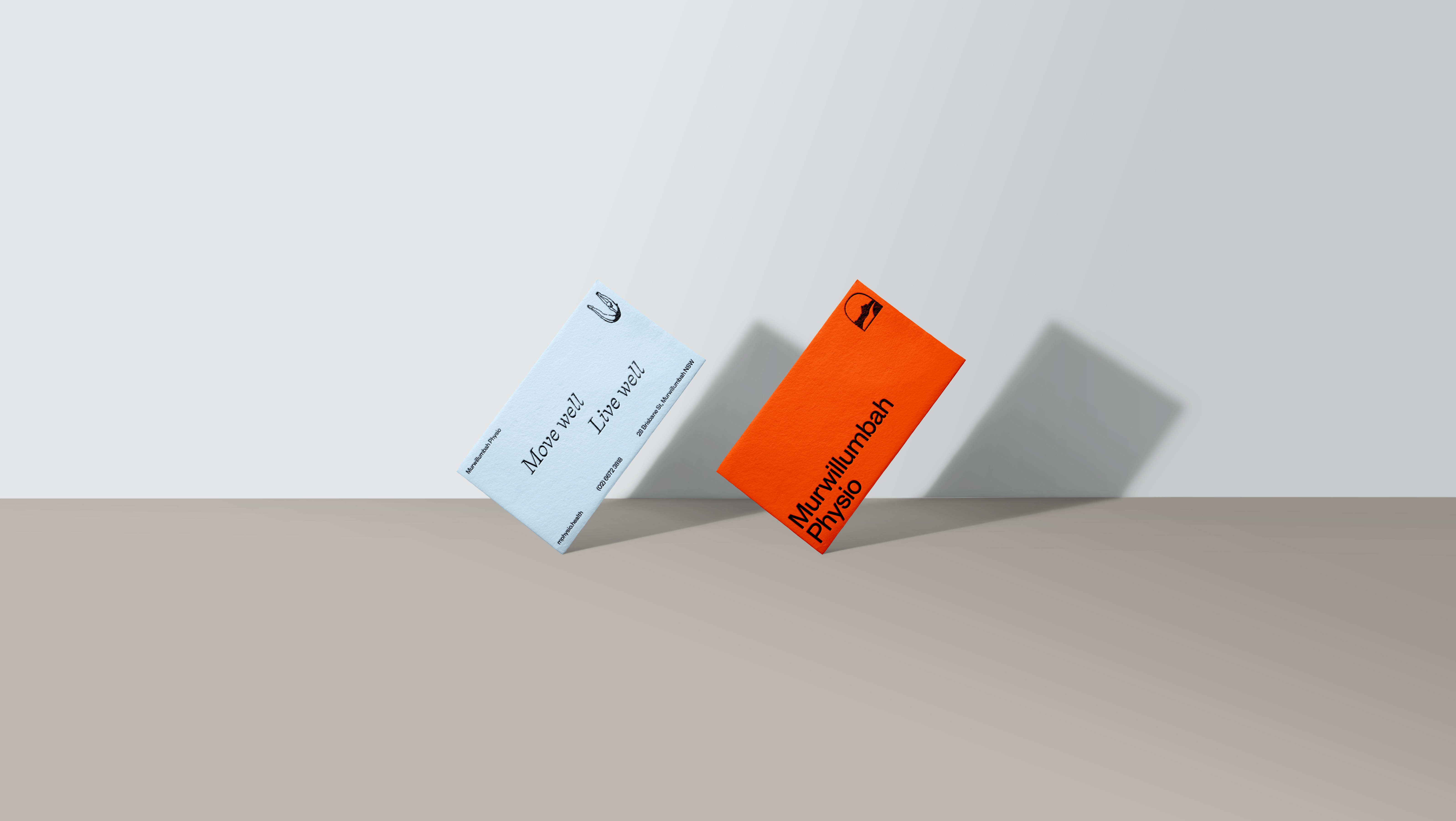
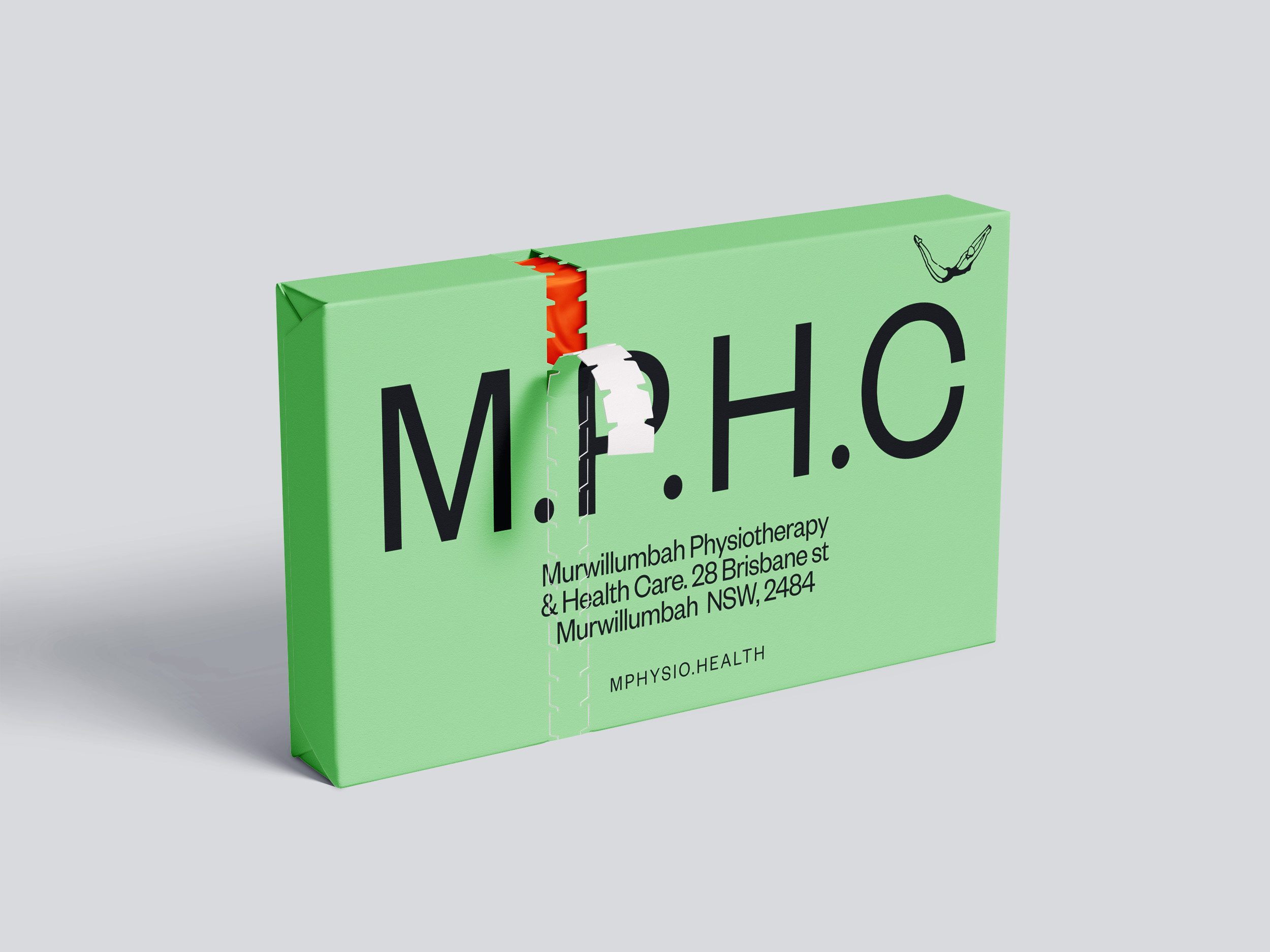
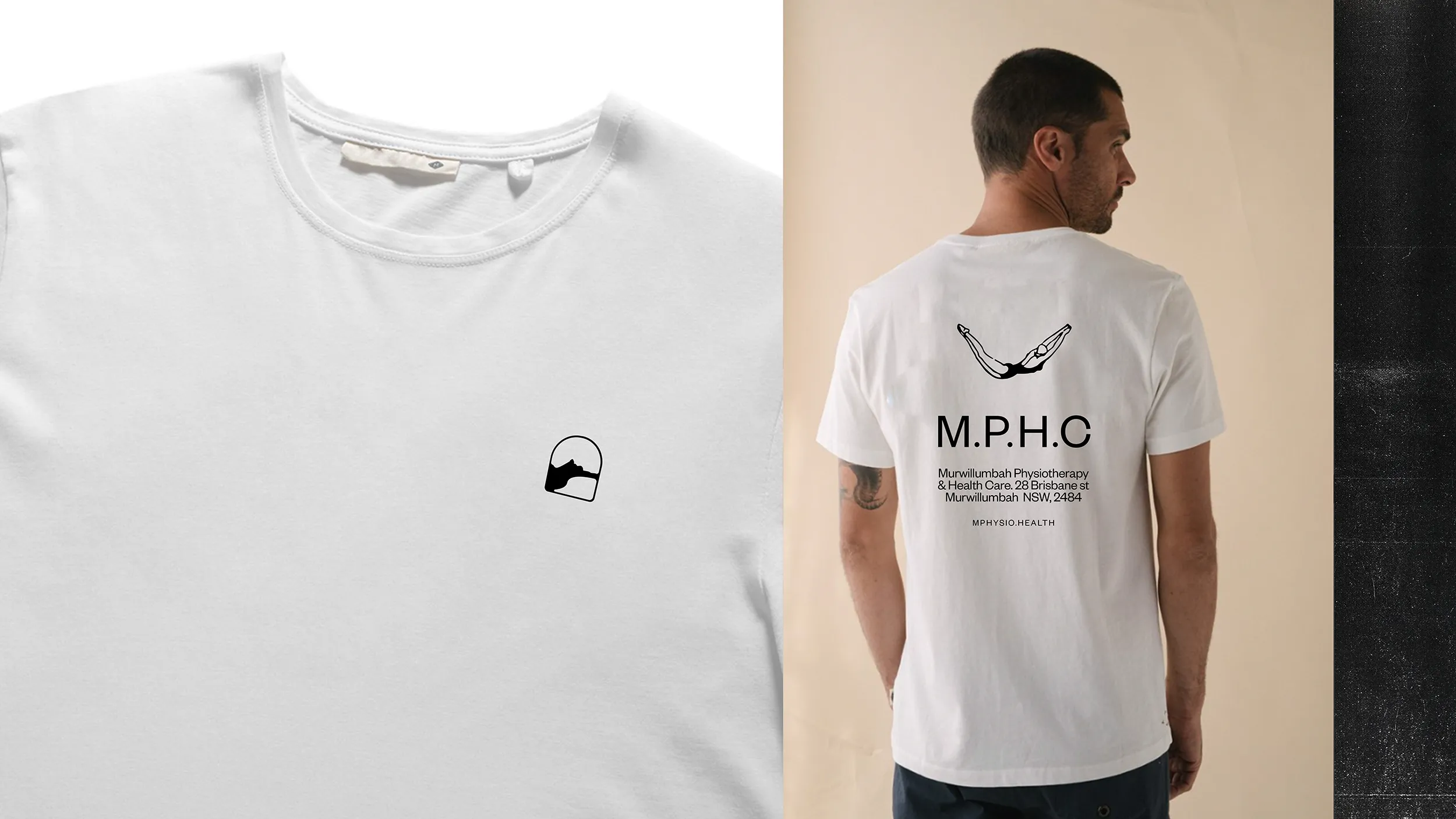
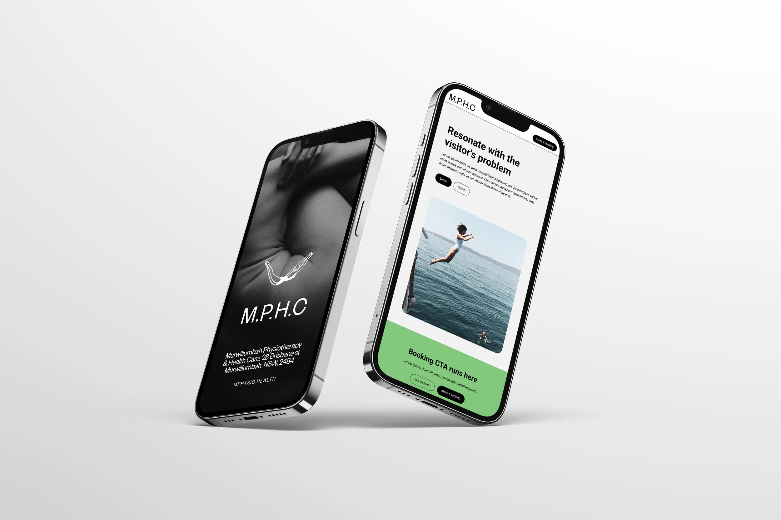
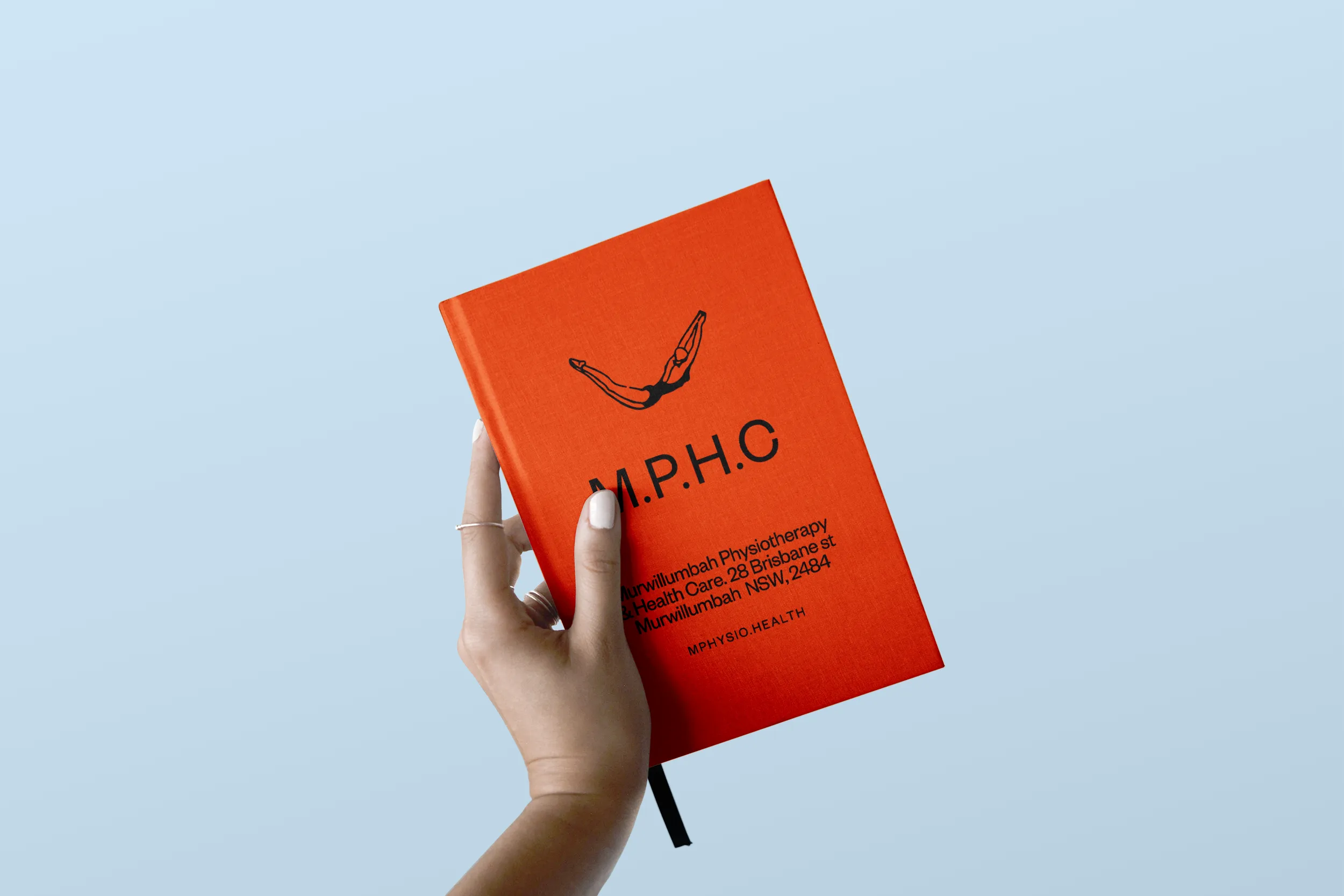
The new logo for MPHC features a energetic orange colour and a modern, handcrafted design. The colour scheme for the brand is inspired by the natural beauty of the local area, with shades of green and warm tones and a bold splash of orange that dominates the colour palette. The website was a quick reskin that was informed by the clients budget and only required to be brought up to speed with the new brand aesthetic and to ensure the incumbent website structure was user-friendly and accessible on all devices. Light touch for maximum return.
To create a rebrand that reflects MPHC's values and positions the business as a modern and welcoming healthcare provider, the design team utilised a holistic approach that included research, brand strategy, founder workshops. We conducted interviews with clients and staff to gain insight into the brand's core values and developed a brand strategy that focused on celebrating movement and feeling well. The design team then used bright, bold colours and a modern, handcrafted design to create a brand that reflected MPHC's new positioning.